The Evolution of Subdued Colors in Combat Uniforms

Why did the bright, colorful insignia of the early 20th century disappear in favor of the muted, low-visibility designs we see on modern combat gear? This post examines the technical and tactical shift from high-visibility heraldry to the subdued color palettes used in modern tactical environments. We'll look at how camouflage patterns, thread colors, and even the material composition of patches have changed to meet the demands of modern combat. Understanding these shifts is vital for any collector of "smalls"—the patches, pins, and insignia that define a unit's identity.
Why Did Military Uniforms Move Toward Subdued Colors?
Military uniforms moved toward subdued colors to minimize the visual signature of a soldier and prevent them from becoming an easy target. In the early days of modern warfare, soldiers often wore bright colors to identify friendly troops, but as long-range optics and high-velocity weaponry improved, being "seen" became a liability. The transition wasn't just about the clothes; it changed the very way insignia and patches were produced.
Early 20th-century combat was often defined by high-contrast aesthetics. Think of the bright reds, blues, and golds seen in the World War I era. These colors served a psychological purpose—bolstering morale and showing unit pride—but they failed the test of field-ready camouflage. As combat moved into more complex environments, the need for "low-visibility" became the standard. This meant that even the patches on a sleeve had to blend in.
The shift happened in waves. First, it was the move from bright cloth uniforms to olive drab (OD) and khaki. Then, it hit the insignia. Instead of gold-plated brass or brightly colored silk embroidery, we saw the rise of olive, coyote, and blacked-out threads. If you're looking at a vintage piece, you'll notice this transition clearly in the thread quality and color saturation.
It's a fascinating period for collectors. You can actually see the tension between a soldier's desire to show off their unit pride and the command's requirement for stealth. Sometimes, the command lost that battle—look at the history of "morale patches" to see how soldiers bypassed official rules. You can read more about that in our piece on why collectors chase morale patches.
How Do Subdued Patches Differ from Traditional Insignia?
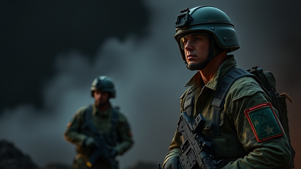
Subdued patches use low-contrast thread colors like olive drab, coyote tan, or black to ensure the insignia does not stand out against the uniform's base color. While traditional insignia often utilize high-contrast colors to make the unit's heraldry pop, subdued versions prioritize concealment. This is the primary difference you'll see when comparing a ceremonial uniform to a field-ready combat uniform.
When you're examining these pieces, look for these three main distinctions:
- Color Palette: Traditional pieces use primary colors (red, blue, yellow). Subdued pieces use earth tones (brown, tan, olive, grey).
- Thread Type: Traditional patches often use silk or high-sheen rayon. Subdued patches use matte cotton or synthetic blends that don't reflect light.
- Edge Finish: Older, formal-wear patches often have a distinct gold or silver metallic thread border. Subdued versions use a simple merrowed edge in a matching color.
The technical evolution of thread has also changed. Modern tactical gear often uses infrared (IR) reflective threads or specialized coatings. These are designed to look "normal" to the naked eye but behave differently under night-vision devices. This is a level of detail that wasn't even a thought during the era of standard wool uniforms. It's a strange, high-tech layer of the "small" collectibles market.
One thing to watch out for is the "fading" aspect. A lot of collectors assume a faded patch is just old, but sometimes it's a result of the specific dye used for subdued colors. If you want to keep your collection looking sharp, check out our guide on protecting embroidered patches from sunlight fading.
Comparison of Insignia Styles
| Feature | Traditional/Ceremonial | Subdued/Tactical |
|---|---|---|
| Primary Goal | Identification & Pride | Concealment & Stealth |
| Color Profile | High Contrast (Bright) | Low Contrast (Muted) |
| Material Feel | Shiny, Silky, Metallic | Matte, Rugged, Textured |
| Common Use | Dress Uniforms/Parades | Field Combat/Patrol |
What Are the Common Color Patterns in Modern Combat?
Modern combat patterns rely on specific color palettes designed to blend with specific environments, such as desert, woodland, or urban terrain. These patterns—like MultiCam or OCP (Operational Camouflage Pattern)—dictate the color of the patches worn over them. You won't see a bright red patch on a camouflage uniform; it just doesn't happen.
The transition to these patterns changed the production of "smalls" entirely. We went from simple colored cloth to complex-patterned fabric. Here is a breakdown of how these colors evolved through the decades:
- The Era of Solid Colors (WWII - Vietnam): Primarily Olive Drab (OD) and Khaki. Patches were often colorful but were eventually replaced by subdued versions for field use.
- The Era of Woodland (1980s - 1990s): Introduction of the Woodland pattern. Patches moved toward deep greens, browns, and blacks to match the forest canopy.
- The Era of Desert (1990s - 2000s): A massive shift toward tan, coyote, and sand colors. This was driven by conflicts in the Middle East and required a completely different set of "subdued" colors.
- The Era of Multi-Environment (Present): Patterns like the Operational Camouflage Pattern (OCP) use a mix of muted greens, browns, and tans to work across various terrains.
It's a constant arms race between the soldier and the enemy's ability to see them. As technology improves, the colors become more nuanced. The colors aren't just "brown" or "green" anymore; they are specific shades of "Coyote Brown" or "Flat Dark Earth." For a collector, identifying the correct shade can actually help date a piece. A patch that is "too bright" for its supposed era is a red flag for a reproduction or a non-regulation piece.
That said, don't get too caught up in the technicalities of the dyes. The real value in these pieces often lies in the history they represent. A subdued patch from a specific deployment tells a story of a specific time and place. It's not just a bit of fabric; it's a piece of a soldier's reality.
The move toward subdued colors also reflects a shift in military philosophy. It's a move from the "heroic" aesthetic of the past—where you wanted to be seen and recognized—to the "professional" aesthetic of the present, where the goal is to remain an invisible, effective force. It's a subtle change, but it's one that's etched into every thread of the modern combat uniform.